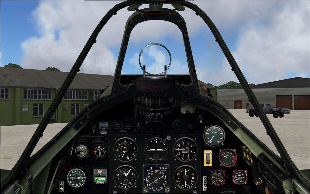
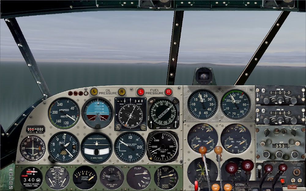
Ok, this has been bugging me ever since I bought a wide screen monitor.
The bmp files for the 2D panel backgrounds in FS9 have to be 1024 x 768 pixels, right? But what if you have your sim set to a different dimension? Well, FS will stretch and squeeze it to fit, that's what. Before the advent of these fancy-pants wide screen digital monitors, this wasn't a problem because the aspect ratio of the monitor pretty much matched that of a 1024 x 768 sized file.
But now I have a monitor which I have set to 1920 x 1200, which is an aspect ratio significantly different (“wider”) than that of a 1024 x 768 file. Still, FS will stretch and squeeze the panel bitmap so that it “fits” the FS screen dimensions, and now it looks all stretched out in the X axis. I hate that! I still like my 2D panels, occasionally, and I can't stand looking at them anymore!
So here's what I did.
The difference in aspect ratio between 1024 x 768 and 1920 x 1200 comes out to 0.833. Meaning if you have a 1024 x 768 file with a circle on it, that you know is going to be shoved into a 1920 x 1200 sized box, you need to “squeeze” your circle in the x axis by 0.833. So your 100 x 100 circle should now be a 83 x 100 oval in order that it look like a circle after the 1024 x 786 file its in is stretched to 1920 x 1200.
So, I took my panel bitmap, and squeezed it by 0.833, and stuck this new cockpit image onto a new 1024 x 768 file with a black background. Then I used FS Panel Studio and adjusted all the gauges in the the X dimension by X * 0.833. Then I re-arranged all the gauges so they fit on the panel, which they did, perfectly, because everything in the X axis has been shrunk by the same amount, see?
I dropped the new panel in the sim and all was right with the world again! Of course, once you drop your shrunken panel image onto your panel background file, you might have to do a little “artwork” to extend the sides of the canopy rails to the left and right sides of the image. I had to do that here, and as you can see, I'm slightly “artistically challenged”, and so it's kind of rough, but you get the idea.
Here is what the panel looks like in FS Panel Studio, before making any adjustments.

But here's what the 2D panel looks like in the sim. Yuck!

Now, here is what my new panel looks like in FS Panel Studio.

And here's what it looks like in the sim. Awesome!

The bmp files for the 2D panel backgrounds in FS9 have to be 1024 x 768 pixels, right? But what if you have your sim set to a different dimension? Well, FS will stretch and squeeze it to fit, that's what. Before the advent of these fancy-pants wide screen digital monitors, this wasn't a problem because the aspect ratio of the monitor pretty much matched that of a 1024 x 768 sized file.
But now I have a monitor which I have set to 1920 x 1200, which is an aspect ratio significantly different (“wider”) than that of a 1024 x 768 file. Still, FS will stretch and squeeze the panel bitmap so that it “fits” the FS screen dimensions, and now it looks all stretched out in the X axis. I hate that! I still like my 2D panels, occasionally, and I can't stand looking at them anymore!
So here's what I did.
The difference in aspect ratio between 1024 x 768 and 1920 x 1200 comes out to 0.833. Meaning if you have a 1024 x 768 file with a circle on it, that you know is going to be shoved into a 1920 x 1200 sized box, you need to “squeeze” your circle in the x axis by 0.833. So your 100 x 100 circle should now be a 83 x 100 oval in order that it look like a circle after the 1024 x 786 file its in is stretched to 1920 x 1200.
So, I took my panel bitmap, and squeezed it by 0.833, and stuck this new cockpit image onto a new 1024 x 768 file with a black background. Then I used FS Panel Studio and adjusted all the gauges in the the X dimension by X * 0.833. Then I re-arranged all the gauges so they fit on the panel, which they did, perfectly, because everything in the X axis has been shrunk by the same amount, see?
I dropped the new panel in the sim and all was right with the world again! Of course, once you drop your shrunken panel image onto your panel background file, you might have to do a little “artwork” to extend the sides of the canopy rails to the left and right sides of the image. I had to do that here, and as you can see, I'm slightly “artistically challenged”, and so it's kind of rough, but you get the idea.
Here is what the panel looks like in FS Panel Studio, before making any adjustments.

But here's what the 2D panel looks like in the sim. Yuck!

Now, here is what my new panel looks like in FS Panel Studio.

And here's what it looks like in the sim. Awesome!


 ity
ity