Aero Commander part II - now it's a piston pounder!

Wild Bill Kelso

Charter Member 2011
Dear folks,

if you don't like aircraft that sound like a vacuum cleaner and "smell like a boy scout camp full of Coleman lanterns", this one might be for you:


zk-cdk_1.jpg


zk-cdk_2.jpg


zk-cdk_3.jpg


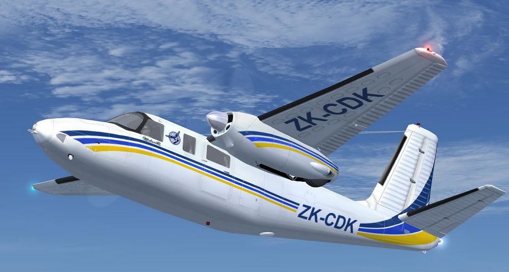
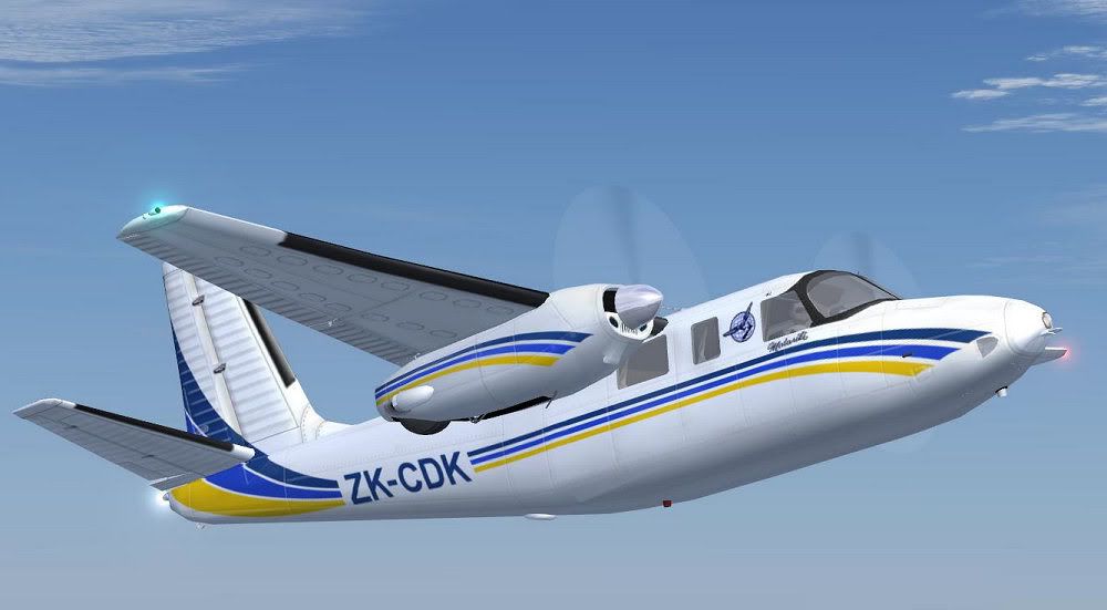
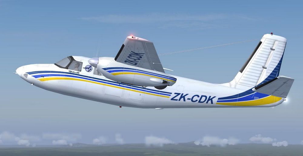
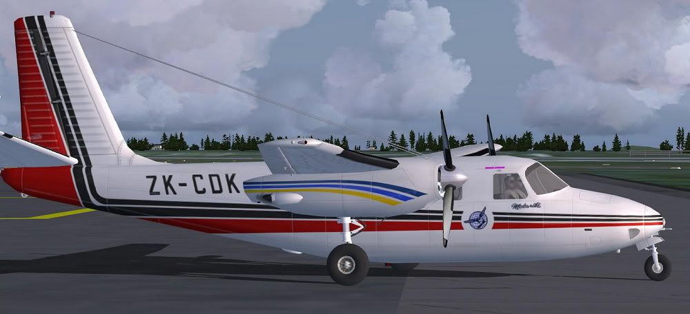
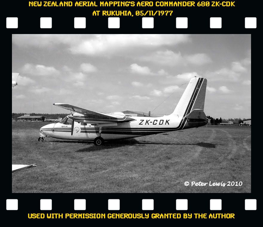
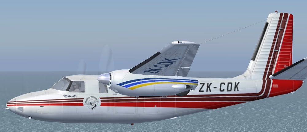
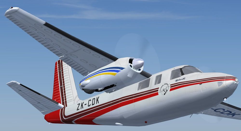
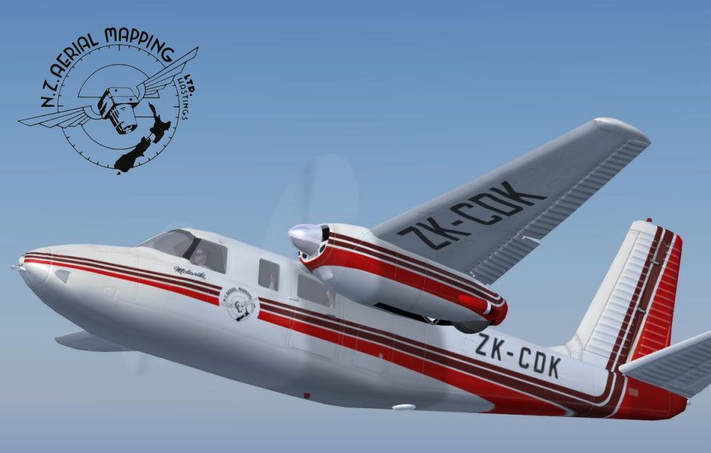
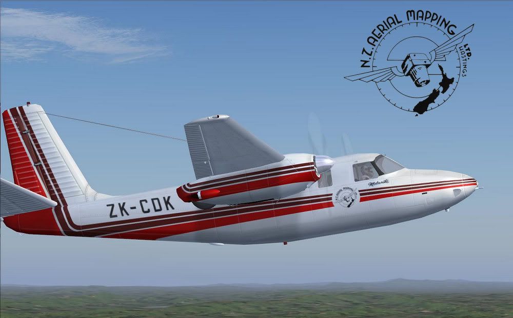
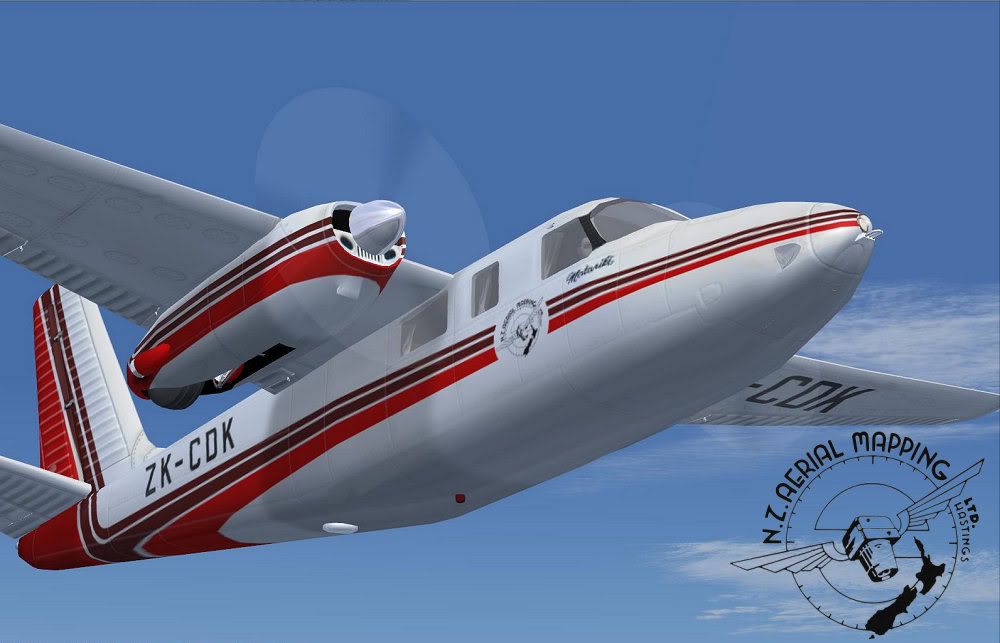
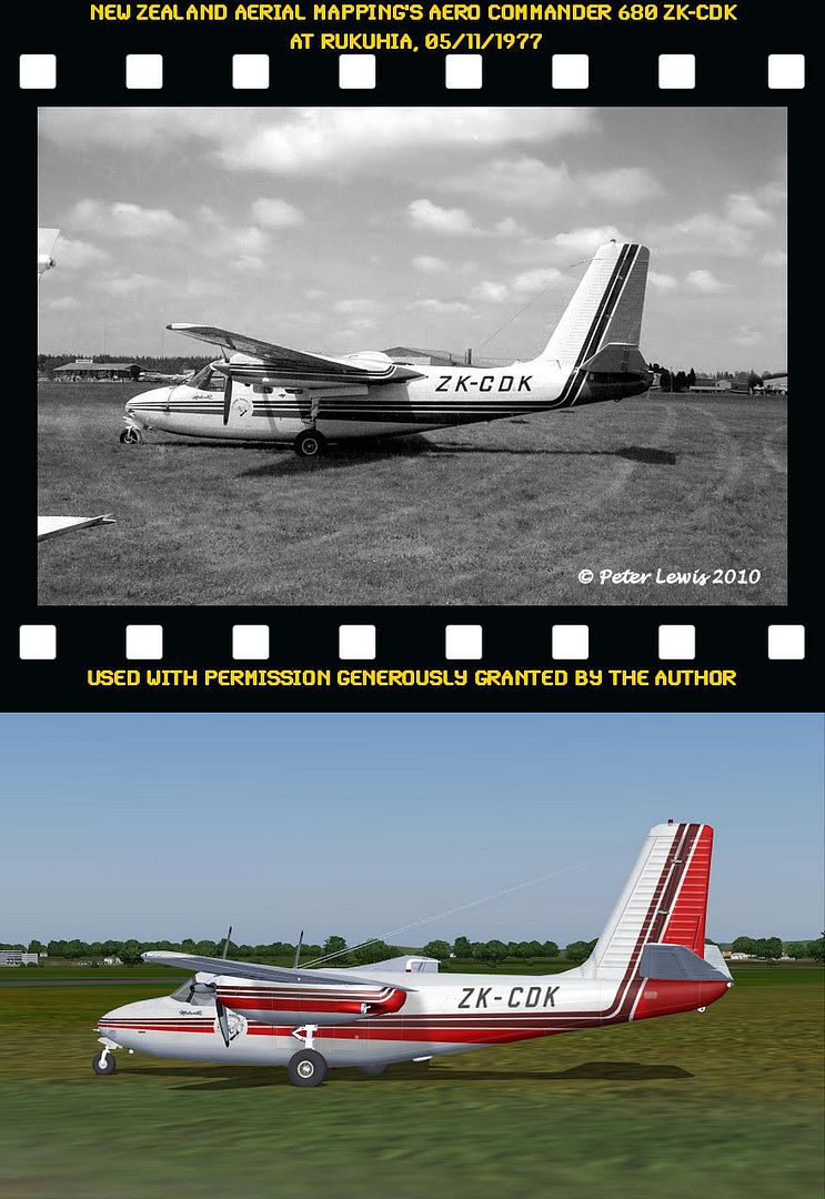
It's New Zealand Aerial Mapping's AC680, basing on Milton's awesome model!
Learn more about it here:

http://www.nzam.com/article.asp?id=history

http://www.wings.net.nz/aerialmap.html


And if you consider to purchase the real one:
http://www.trademe.co.nz/Trade-Me-Motors/A...n-300437684.htm

Those curved tapering cheatlines turned out to be a real nightmare, but I think this should do...

Just some final checking and packing, should be up in a few days!

Cheers,
Markus.
 
:applause:
Another very handsome repaint, Markus.
Be quite interesting to fly the two Aerial Mapping planes back-to-back!
 
Superb artwork. I notice that the real aircraft has the non-geared Lycomings and more streamlined nacelles, also found on the AC500. Any chance of doing this same paint job for Milton & Co's Shrike Commander?
 
Thank you guys!
But I think it's really hard to spoil a repaint on a gorgeous aircraft such as this...

@expat:
I know the real CDK bears the "box-shaped" nacelles of the Shrike, but the texture mapping of the AC500S is quite different from the 680 model, so there would be a lot of adjustments neccessary. Since I'm not the most patient guy when it comes down to a waiting game like this, I'd better skip it...
Hope you don't mind!

Cheers,
Markus.
 
Hi, folks!

I hope you all can live with the compromise of this Commander carrying the 'wrong' nacelles.
But in my eyes, the Shrike's airframe with its pointy nose and the eyebrow windows isn't close enough to the real one...

Anyway, this one will be the next in line - first work-in-progress shot of the 1977 appearance:

zk-cdk_1977_1.jpg


Hard to tell from this pic

ZK-CDK1977.jpg


or even from this coloured one:
http://www.wings.net.nz/0207056.html

if the two upper cheatlines actually were black (or dark red?).

Anyone an idea?

Cheers,
Markus.
 
They were not black - probably burgundy.
I'm sure an email to Aerial Mapping would sort you out.
 
...probably burgundy.
That's what I've thought when looking at the coloured pic.
Although it looks some tinted...

I'm sure an email to Aerial Mapping would sort you out.
Good idea, Charl!
Maybe they could help me out with some high-res logos as well.
Now where's my "serious correspondence dictionary"? :d


@ Jon:
I knew you'd like it! Didn't I told you that one day I'm going to push Milton's Commander into the paint shack?

Cheers,
Markus.
 
Thank you for your suggestion, Charl!

In the meantime, I've received a very kind reply from NZAM:

The upper two cheat lines are not black as you have guessed. They are a very dark reddish brown colour. The lower one is a bright red. Another thing the body of ZK-CDK is a very pale grey, not white in its latest livery.

Additionally, they've sent me a very fine graphic file of the NZAM 'Globe' logo of which I'm pleased to include it into my repaint.
A heartfelt "Thank you!" goes to New Zealand Aerial Mapping Ltd.!

First results, considering these details:

zk-cdk_1977_2.jpg


zk-cdk_1977_3.jpg


Still a lot to do...
 
Thanks, claudius!

It's done!

ZK-CDK1977_1.jpg


ZK-CDK1977_2.jpg


ZK-CDK1977_3.jpg


ZK-CDK1977comparison.jpg


I love those comparison shots...

Upload to the usual places finished.
Have fun!

Cheers,
Markus.
 
Back
Top