Bookman1960
SOH-CM-2023
Well, it looks like after my earlier post about the prototype pain schemes of the Lockheed Starlifter and Galaxy models there are no repaints available.
If this is the case, I know what I'll be doing once things cool down outside and I can sit in front of my PC again without three fans running -- working on some repaints.
But, just in case...has anyone see these available?
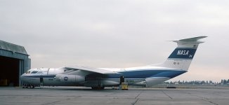
NASA received an early Starlifter (L-300-50A) and converted it to a flying observatory - the Kuiper Airborne Observatory. I've managed to gather photos of the schemes seen when it was operating. It has since been retired and replaced by the larger 747SP 'SOFIA' observatory.

early scheme

later scheme (with older logo)

later scheme (with final logo)
If this is the case, I know what I'll be doing once things cool down outside and I can sit in front of my PC again without three fans running -- working on some repaints.
But, just in case...has anyone see these available?
NASA received an early Starlifter (L-300-50A) and converted it to a flying observatory - the Kuiper Airborne Observatory. I've managed to gather photos of the schemes seen when it was operating. It has since been retired and replaced by the larger 747SP 'SOFIA' observatory.
early scheme
later scheme (with older logo)
later scheme (with final logo)


")
