-
Please see the most recent updates in the "Where did the .com name go?" thread. Posts number 16 and 17.
-
IMPORTANT DOWNLOADING INFORMATION - ALL MEMBERS PLEASE READ
Please see this thread for updates. Update Thread
SOH ADMINISTRATION
You are using an out of date browser. It may not display this or other websites correctly.
You should upgrade or use an alternative browser.
You should upgrade or use an alternative browser.
Water textures from FSX to CFS2?
- Thread starter langereis
- Start date
If my memory serves me correctly someone had converted FS9 water textures back when "The Zone" was in operation. Only those who had powerful kick butt PCs could actually run them however...back as far as 2001-2002 maybe? I distinctly remember the multitude of screenshots everywhere.
Sadly my AMD 1.33, ATI 7200 didn't fair well enough to run 'em...
Somebody remember that?
Sadly my AMD 1.33, ATI 7200 didn't fair well enough to run 'em...
Somebody remember that?
dvslats
Charter Member
Yeah p14u2nv, I remember that. It was the detail in those that caused a resource overload. My video card was only a tnt something or other with 32 megs of memory. Today's newer hardware really made CFS2 look brand new. 
I had some time today and did some experimenting with a set of custom water class textures. Google earth to PSP to Image tool.
My goal was to create something to emulate the shallow to deep ocean effect, keeping the highest detail possible without getting into the striping. And also to keep them on the generic end where they would fit in just about anywhere in the Pacific.
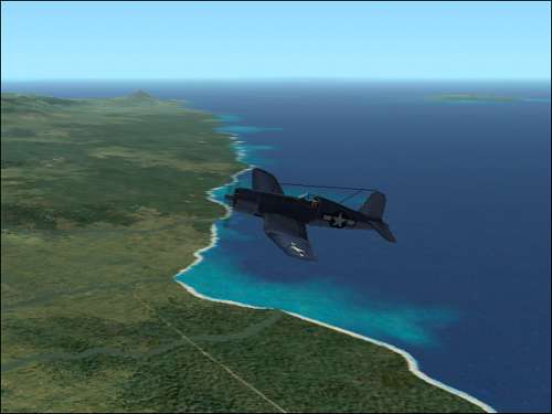
Here's what today's results are. Some of the hues are still off a bit...this is in the Solomons. Opinions?
I had some time today and did some experimenting with a set of custom water class textures. Google earth to PSP to Image tool.
My goal was to create something to emulate the shallow to deep ocean effect, keeping the highest detail possible without getting into the striping. And also to keep them on the generic end where they would fit in just about anywhere in the Pacific.
Here's what today's results are. Some of the hues are still off a bit...this is in the Solomons. Opinions?
Jagdflieger
Jr. Admin
H2O Textures
It certainly gives the effect of waves rolling in toward the beaches. I think that it looks pretty good.
One thing about the ocean in real life is that it changes daily depending on clouds, light, position of the sun and wind. I don't think that there is one magic bullet for CFS 2 water textures, but the more options we have the more we can tweak it to our preferences or theater.
Sometimes I think that it's a shame CFS 2 won't support reflective water, but I rarely use or appreciate the feature in FS 9 so I don't think that we're hampered in any way with the senior sim.
dvslats
Charter Member
One thing about the ocean in real life is that it changes daily depending on clouds, light, position of the sun and wind. I don't think that there is one magic bullet for CFS 2 water textures, but the more options we have the more we can tweak it to our preferences or theater.
That sums it up pretty good Jagdflieger. Being landlocked, my views of the real ocean are far and few in between. With your extensive travels you should be a good go to person on the subject. Thanks for the input.
When I'm satisfied with these, they'll be bundled and uploaded for ya'll to use at will and your own risk. He heee
Dv
dvslats
Charter Member
By the way, somebody knows what is causing this :
Hello Brunosk, Can you guess the distance you are from land? If it is more then 50 kilometers, the look in the background/land is the Base Color of the sim. The land class textures will show through the nine Lod's/mips, up to 48 or so kilometers. After that the base color is used. Frame rates you know. For me...I keep the max visibility level in settings to 25 to 30 miles. This will put a kind of fog over the horizon. Call it a very humid day.

Dv
dvslats
Charter Member
Update Brunosk
Disregard the above post Brunosk.
I flew to your coordinates and there is no land.
It looks like a format issue in one of the water textures. Are you using egypt's
Med. water?
If so, he has fixed the textures and put them in a new download a month or so back.
If you hover your mouse over the water class texture it should show a size of 86.4 kb
Dv
Yeah p14u2nv, I remember that. It was the detail in those that caused a resource overload. My video card was only a tnt something or other with 32 megs of memory. Today's newer hardware really made CFS2 look brand new.
I had some time today and did some experimenting with a set of custom water class textures. Google earth to PSP to Image tool.
Dave are these "custom textures" you spoke of originally meant for FS9? Is that correct? Just curious. Like I said earlier I tried them way back when...and you are correct with the newer hardware we now have we stand a better chance of running what was once high end only.
I, like so many others here, really appreciate what you are doing for all of us. Thank you very much.
Disregard the above post Brunosk.
I flew to your coordinates and there is no land.
It looks like a format issue in one of the water textures. Are you using egypt's
Med. water?
If so, he has fixed the textures and put them in a new download a month or so back.
If you hover your mouse over the water class texture it should show a size of 86.4 kb
Dv
Well, to tell you the truth I don't remember which water textures I use...
I did check as you suggested, all the "waterlike looking" textures I have are 86.4 kb...
Looks like at some point in the distance the sim uses one of the clear ones instead of the basic darker texture which is in the foreground ?
Oh and by the way, I do set my max visibility low as well...
CrisGer
Charter Member
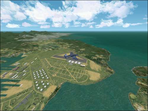
I am following your work with great interest Slats as i hope to be able to combine what you are able to convert with a new project i began a while ago to set up a new Pacific Water Texture affect that will try to convey the brilliant azure and deep blue of the deep Pacific with the sparkling emerald hues of the shallow water. I have not found any one water set that conveys both, though some of the sets created already are very nice. I have been working on it for a while and am going to take a break from it because i have other work i have to do, but I did find some good balances so far. I was hoping to help add a custom water set for Pearl Harbour too, as the harbor is darker and bluer than any of the water textures i have seen yet. I found by experimenting that it is the texture called : 007h2w1 that covers most of Pearl harbour itself. Working with that and other areas i have found a balance that seems to at least present a comprimise that works. I guess optimally it would be ideal to have custom waterclass sets for each island group, as they are all diffent to a degree. One of the big challenges is that you cant use a very detailed texture in a large area as it stripes out easily.
So here are a few pics and hopefully once DvSlats gets some textures converted I may be able to match some of the effects i have found with just the old stype CFS2 texture style so far.
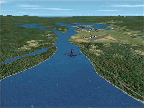
The hardest challenges are the detailed and large areas like Truk Lagoon that Jean Bomber did so beautifuly to match the old PacTex green tone. Mine is a deeper blue and will need to be adjusted, but for now, i have some more generalized solutions that work for a range of locations, here are pics from Henderson, Port Moresby, Pearl and French Polyneisa, Bora Bora...
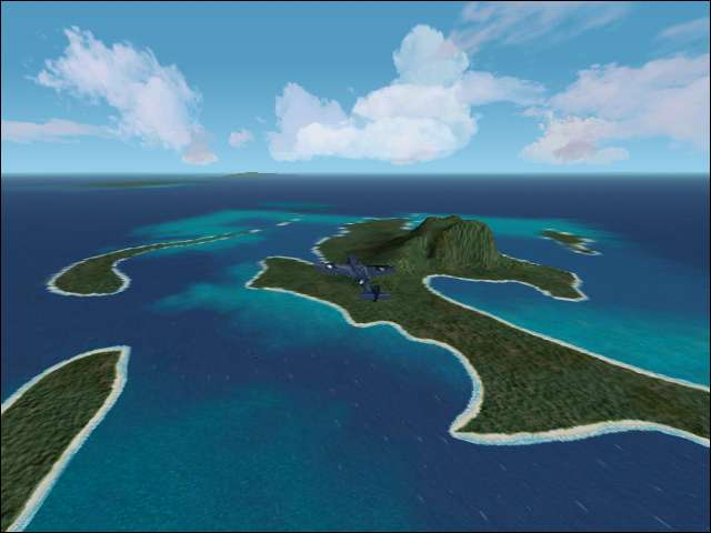
Bora Bora French Polyneisa NewBlue2
Bora Bora NewBlue2
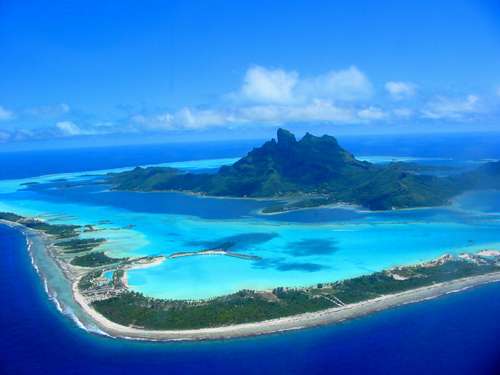
the Real Bora Bora
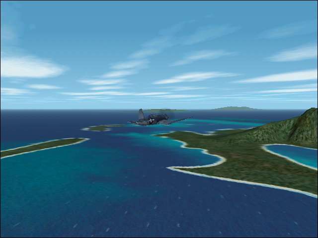
Port Moresby NewBlue1
Henderson NewBlue2
the original blue textures are from two sets by BlueDevil and JIMKO, Pac-Blue ACM and Pacific Blues including a very nice deep blue with white caps and a double line of breakers in the surf. Nothing could be release from this set without their permission first ...so for now..this is a working project and I am sharing the concept ...and hopes. It may not work out.... it is very tough to get a good generalized water range of colours that works for all areas in the Pacific but i just had to try as I love the beautiful blues of that part of the world.

For Pearl, i started with the Pac Tex colours...
and then tried to match some photos that were both darker and bluer, with a green variant and then ended up with this blue for the harbour, which it is on a sunny day,
it looks especialy good at ground level from the faciltieis looking across the bay...and also does a fairly decent job as an under colour for the ariel view, it would be better to have variations and swirls in areas, as it is browner in some parts of the harbor and greener in others but I dont want to distract the Pearl team as they are working to release the remaining parts of the wonderful new Pearl PH2 set.
for now, this is a sharing of concept and suggestions and commments are welcome and work will continue as we continue to work with improving the textures as dvslats is doing so nicely.
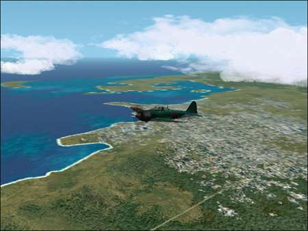
BTW the land colours are Pac1 and though a bit brown compared to some they are quite subtle and realistic in a lot of ways..and for now they make an excellent counterpoint to the water ....
Here is one of Dog's very nice enhanced bases...and the ocean water acts as a very nice counterpoint to it all.

So here are a few pics and hopefully once DvSlats gets some textures converted I may be able to match some of the effects i have found with just the old stype CFS2 texture style so far.
The hardest challenges are the detailed and large areas like Truk Lagoon that Jean Bomber did so beautifuly to match the old PacTex green tone. Mine is a deeper blue and will need to be adjusted, but for now, i have some more generalized solutions that work for a range of locations, here are pics from Henderson, Port Moresby, Pearl and French Polyneisa, Bora Bora...
Bora Bora French Polyneisa NewBlue2
Bora Bora NewBlue2
the Real Bora Bora
Port Moresby NewBlue1
Henderson NewBlue2
the original blue textures are from two sets by BlueDevil and JIMKO, Pac-Blue ACM and Pacific Blues including a very nice deep blue with white caps and a double line of breakers in the surf. Nothing could be release from this set without their permission first ...so for now..this is a working project and I am sharing the concept ...and hopes. It may not work out.... it is very tough to get a good generalized water range of colours that works for all areas in the Pacific but i just had to try as I love the beautiful blues of that part of the world.
For Pearl, i started with the Pac Tex colours...
and then tried to match some photos that were both darker and bluer, with a green variant and then ended up with this blue for the harbour, which it is on a sunny day,
it looks especialy good at ground level from the faciltieis looking across the bay...and also does a fairly decent job as an under colour for the ariel view, it would be better to have variations and swirls in areas, as it is browner in some parts of the harbor and greener in others but I dont want to distract the Pearl team as they are working to release the remaining parts of the wonderful new Pearl PH2 set.
for now, this is a sharing of concept and suggestions and commments are welcome and work will continue as we continue to work with improving the textures as dvslats is doing so nicely.
BTW the land colours are Pac1 and though a bit brown compared to some they are quite subtle and realistic in a lot of ways..and for now they make an excellent counterpoint to the water ....
Here is one of Dog's very nice enhanced bases...and the ocean water acts as a very nice counterpoint to it all.
miamieagle
Charter Member
Wow!
Its looking Great!
Its looking Great!
Ghostrider
Charter Member 2012
Looking good there, Cris! I am just having a couple of ideas - first, the 'tiling' effect might be used to advantage with some alternating subtly lighter/darker "stripes" across the tiles which would line up with each other when placed edge to edge, creating the illusion of ocean swells which are parallel with each other. Probably done at an angle across the 'tile', and very subtle, experimenting with different "wavelengths" so the visual effect was not overdone. Anyway, I know it's lots of work, and maybe a bad idea, I'm just 'thinking out loud'.
Also, taken to the nth degree, this could be done like FSX programs which swap out cloud, sky, water textures et al, in fact, just about any environmental texture you want, to reflect different conditions. Morton's MK CFS2 utility already does this with aircraft and ships by simply renaming certain files with a batch routine to "activate" the ones you want. You could have diferrent texture sets for diferrent geographical areas, as well as different sky and weather conditions. Bright sunny days would have an entirely different set of textures from dark days, for example. This may be alot more work than it's worth, just "spitballin' ".
You just had to put Bora Bora pictures in there too - I have sailed from Raietea throught the western pass of BB (only way into the atoll) and spent some incredible nights anchored under the volcano off of Vaitape, and and the various motus - some of my all time favorite memories!
CrisGer
Charter Member
Ghost thanks for your suggestions i think they are good ones. My challenge is time and work load, i am swamped at the mo. but hope to get back to this soon, as i do enjoy working with such challenges as it is close to my own work.. painting, and i really enjoy trying for realism in the sim. I think the texture swapping idea is very intriguing, I had to give up on trying to get a dawn and dusk effect that works as the water textures dont change i dont think ..just the lighihting.... but i will keep tryiing. thanks again.
I am going to use bora bora as a test bed.
I am going to use bora bora as a test bed.