• There seems to be an uptick in Political comments in recent months. Those of us who are long time members of the site know that Political and Religious content has been banned for years. Nothing has changed. Please leave all political and religious comments out of the forums.

    If you recently joined the forums you were not presented with this restriction in the terms of service. This was due to a conversion error when we went from vBulletin to Xenforo. We have updated our terms of service to reflect these corrections.

    Please note any post refering to a politician will be considered political even if it is intended to be humor. Our experience is these topics have a way of dividing the forums and causing deep resentment among members. It is a poison to the community. We appreciate compliance with the rules.

    The Staff of SOH

  • Server side Maintenance is done. We still have an update to the forum software to run but that one will have to wait for a better time.

Virtavia B-29

Yes, someone did make that repaint and I have it BUT I tried to find a download link/location and could not find one right off. I'm sure someone will post it here soon.
 
Cool ....saves me doing one...;)
I've been reworking the Kit more to my liking...and ending up with some oddities [what-ifs] .... like a Qantas commercial version...

I didn't much like the way the colouring/shading/spec was done in the Kit so did it 'my way'. Gotta rework the bumps for all my windoze next.....;)

attachment.php
 

Attachments

  • B-29-Qantas4.jpg
    B-29-Qantas4.jpg
    58.1 KB · Views: 0
A more 'real' one I've been reworking a bit..... and I found how to get a bit of Spec into the spinners .... ;)

attachment.php
 

Attachments

  • B29-Fifi-1.jpg
    B29-Fifi-1.jpg
    41.9 KB · Views: 2
Concentrating on this one....as always...annoying sectioning of the paint.... the nose numbers are....entertaining....

attachment.php


At least the Enola font will be right....pulled it off the real one...;)
 

Attachments

  • B29-Enola-1.jpg
    B29-Enola-1.jpg
    44.9 KB · Views: 1
I reckon I'm getting close with Enola....added the wing paint panels ....

attachment.php
 

Attachments

  • B29-Enola-Final.jpg
    B29-Enola-Final.jpg
    73.3 KB · Views: 1
Found issues with painting....bits of fuse that are repeated...kinda makes detailing problematic....either don't add it...or end up with 2.

Happy with the left side though.....even rewrote the notes...;)

attachment.php


Here 'tis...

attachment.php
 

Attachments

  • B29-Enola-Final2.jpg
    B29-Enola-Final2.jpg
    33.1 KB · Views: 0
  • B29-Enola-Final3.jpg
    B29-Enola-Final3.jpg
    65.3 KB · Views: 0
Last edited:
Finished Fifi ....
....took a bit of chasing for details...duller metal finish than Enola, it seems....and wing walkway is different....

attachment.php


Time to compile the DDS's and upload both...;)

Here's Enola....same lighting...

attachment.php
 

Attachments

  • B29-Fifi-Final.jpg
    B29-Fifi-Final.jpg
    35.8 KB · Views: 2
  • B29-Enola-Gay-Final.jpg
    B29-Enola-Gay-Final.jpg
    37.1 KB · Views: 0
Very nice repaints, Jafo!

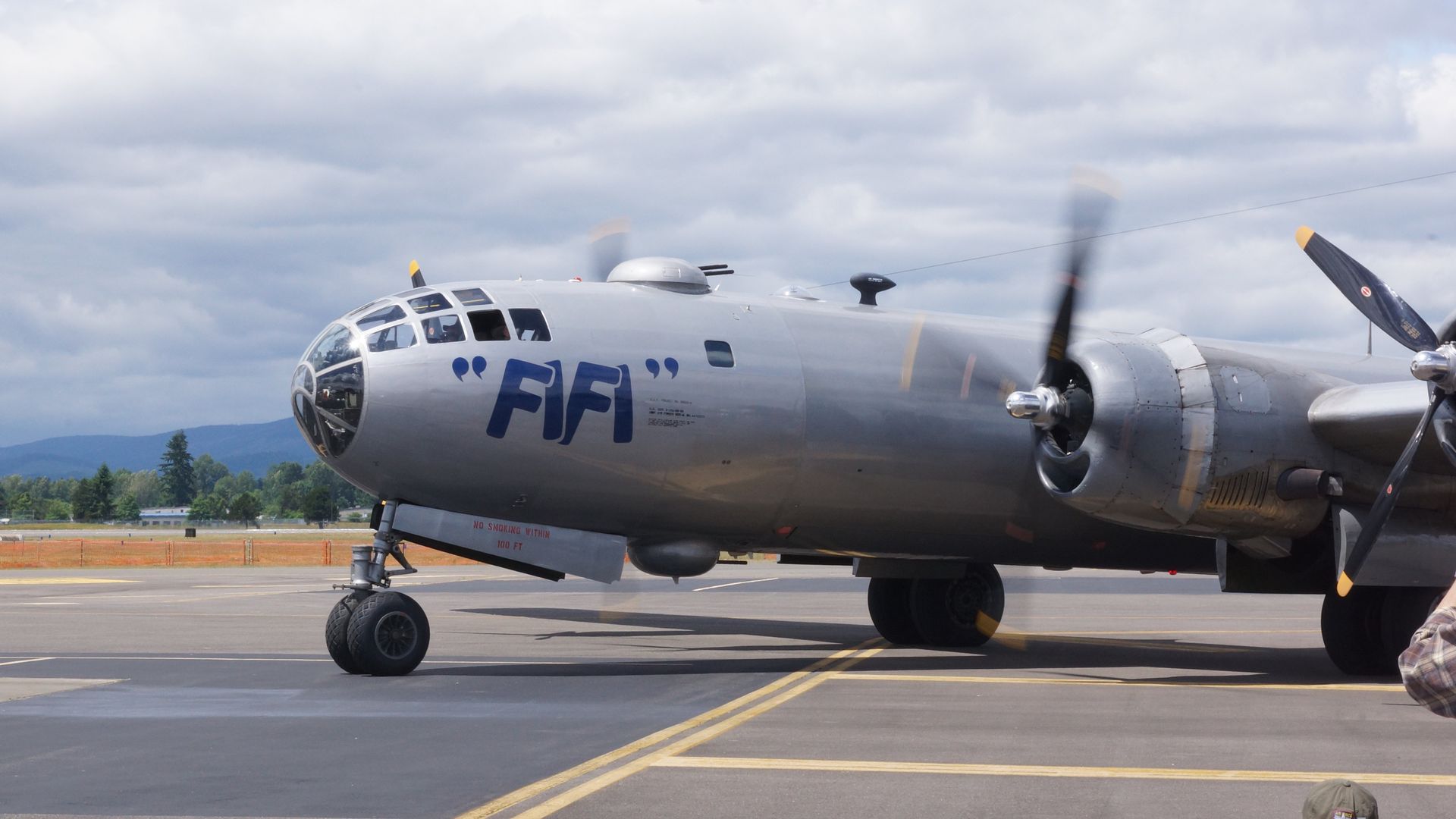
The reason for why the CAF's B-29 "FIFI" looks the way it does, is because it is painted silver/grey overall, it isn't natural metal (save for the cowl rings and exhaust shroud panels) - the paint itself is quite dated now as well. The details of its external finish aren't very authentic either - for instance, when it was last painted (I believe it was free/donated service), the company accidentally painted all of the stars & bars in black & white, rather than insignia blue & white (the "FIFI" name was done in blue).

Of course the original "Enola Gay", at the Smithsonian, has had all of its original natural aluminum polished (its metal finish having oxidized quite a lot over the decades, prior to restoration/conservation efforts), to resemble the un-polished, fresh-Alclad look it had in 1945. On your repaint of "Enola Gay", I particularly like what you did with the metal finish vs. the silver-painted sections - it looks very true to life/accurate!
 
Re 'Fifi', yes, it's blue...but as with all online photos....the blue shows up differently on several [along with specific details not always the same/vintage]. I chose a relatively darker blue than what's in some pics....comes in at RGB 8-28-60....and was toying with doing the spec brighter....so it'd end up all sortts of shades depending on the lighting...but decided conservative was the go...;)
 
Hey guys, maybe this will help..


Taken in 2014 when Fifi visited our area.

Yes....but the problem always arises....accuracy of colour reproduction. I've seen lighter....and darker. Half the time you have to find a reference point...something whose colour is known...and determine the chroma shift.
And when details elsewhere are painted differently/missing on some photos you suspect such things as 'fifi' might even have been repainted more than once....and in different colour hues...;)

Your photo looks like it has a blue-shift, if anything...which will accentuate blues. Is the grass too blue...less green...and is the yellow paint on the tarmac maybe less yellow than it should be?
It's hard to tell reality from Kodak-getting-it-wrong...;)
Not sure if I agree with your perception.

Why don't you contract CAF directly and ask them what color it really is. They have a page on FB that reports on Fifi's schedule, so I'm sure they can address your questions.
 
Not sure if I agree with your perception.

You may need to....as a colour pick of the static prop blade in your picture gives an RGB of 80,80,100.
25% too much blue when the 'expected' would be 80,80,80 for a gloss-shifted/lighter 'black'....;)
Same issue with the 'black' radome/antenna.

Here's what you get when the blue is pulled back 18% to make the blacks black.....quite a substantial difference....;)

attachment.php
 

Attachments

  • colour test.jpg
    colour test.jpg
    48.2 KB · Views: 0
Back
Top