-
Please see the most recent updates in the "Where did the .com name go?" thread. Posts number 16 and 17.
You are using an out of date browser. It may not display this or other websites correctly.
You should upgrade or use an alternative browser.
You should upgrade or use an alternative browser.
Classics Hangar Fw190D-Ta152H Released
- Thread starter Mathias
- Start date
JensOle
SOH-CM-2023
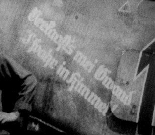
The k in Verkaaft's is as it looked on the real red 1. I have not used a font, but hand made the letters on top of a picture scan. Read my above post and you will get the answer to foahr. As most of the letters looked the same as per the picture, i copied some of the hand made letters for the next similar letter. The e crept in as a mistake. I believe and hope all the others should be correct... Red 1 and the other doras of jv44 are very well documented with pictures taken by american soldiers arriving at munchen riem and ainring airfield days after the war was over. Many of them are in the book I mentioned. This makes these Doras actually some of the easiest to research. The actual paint, as with most luftwaffe aircraft, is never the less quite time consuming to get right. Much easier with the british and american aircraft...lol
I appreciate the discussion regarding the smaller details!
I appreciate the discussion regarding the smaller details!
thunder100
Charter Member 2010
Its just as you are so closein all stunning details allready and so I (and Manfred) just try to help with that last details
Roland
Roland
It should be a 'k', Jens-Ole, unless it was a painter's error originally (can't check). The saying is never quoted as "Verlaaft's", even referring to Sachsenberg's plane.
One profile painting has it like this:

Don't know how reliable this is, of course. Anyway, it reads "Verkaufts" (don't think there is an apostrophe) and "I 'fahr", probably not quite right either, but making good sense.
One profile painting has it like this:

Don't know how reliable this is, of course. Anyway, it reads "Verkaufts" (don't think there is an apostrophe) and "I 'fahr", probably not quite right either, but making good sense.
JensOle
SOH-CM-2023
No worries 
As I said, I made the letters from a picture of the real Red 1... That profile is definitely wrong. It should be painted as a l with barely visible k "claws"
http://farm8.staticflickr.com/7359/8731012373_a1be8d2d73_z.jpg
Closest profile drawing I have seen of the real Red 1.
http://i48.tinypic.com/oteosg.jpg
JensOle
SOH-CM-2023
I'll be home again later today and the plan is to upload a pre release version of Red 1 to this thread for some feedback before final release.
Another small detail I'll change is to make the JV44 badge a bit bigger (it was a bit small judging from the pictures)
I stumbled across info mentioned a "D-11, Red 2" which flew with the Platzschutzstaffel, do any of you guys have any info about this?
I believe the info originate from the book "The Focke Wulf FW 190 Dora: Volume 2" by Jerry Crandall. I do not have the book myself (yet), but the author has done the dedicated booklet I mentioned earlier about the JV 44 Doras so he is definitely to be considered as an expert on the topic.
big-mike
SOH-CM-2022
The white from the markings is very bright.
Cheers,
Huub
I don`t see this,may depend on the monitor calibration.
Mike
JensOle
SOH-CM-2023
The white from the markings is very bright. Perhaps you could tone this down a bit.
But it already close to perfect.
Cheers,
Huub
Hello!
That was my intention.. lol. I used the same brownish white as on the cross, but after the last adjustment to the text I might have forgotten to change the colour from the hi res text I use as a starting point. I'll check it.
Bump 
I just noticed that this bird is on sale half the price at simmarket now. It should show on the first page and it sale seems to end by 10/12/2014. I've been thinking of getting this one for a while and for this price I couldn't resist anymore
Here's the link to the product:
http://secure.simmarket.com/classics-hangar-fw-190d-ta152h-fsx.phtml

I just noticed that this bird is on sale half the price at simmarket now. It should show on the first page and it sale seems to end by 10/12/2014. I've been thinking of getting this one for a while and for this price I couldn't resist anymore

Here's the link to the product:
http://secure.simmarket.com/classics-hangar-fw-190d-ta152h-fsx.phtml


