-
Please see the most recent updates in the "Where did the .com name go?" thread. Posts number 16 and 17.
-
IMPORTANT DOWNLOADING INFORMATION - ALL MEMBERS PLEASE READ
Please see this thread for updates. Update Thread
SOH ADMINISTRATION
You are using an out of date browser. It may not display this or other websites correctly.
You should upgrade or use an alternative browser.
You should upgrade or use an alternative browser.
Early / Mid-1942 USN / Japan 1941 skins by UncleTgt!
- Thread starter dasuto247
- Start date
aw shucks, now you're making me blush
To be honest, I don't think MS gets enough credit for the stock paints. They are incredibly detailed & nuanced, & so with a bit of work they make excellent monocolour canvasses.
You'll also notice with these bitmaps that I used a lot of Smashing Time's paintwork for those smaller interior details he added to the stock paints. Much kudos to another pioneer...
Currently taking a rest from US carrier paints (though I do have the Hornet, & early Enterprise sets pretty much done). Currently revisiting the Jap stockers, maybe there's a similar thing to be done with their carrier airgroups ... Let's see how I get on.

Love the work.Looking forward to the Hornet an Enterprise sets

kelticheart
Charter Member
......To be honest, I don't think MS gets enough credit for the stock paints. They are incredibly detailed & nuanced, & so with a bit of work they make excellent monocolour canvasses......
I fully agree with that, UncleTgt.
We talked about it, at the time I was trying to supply better historical repaints for the PHP2 pack, and we both came to the same conclusion.
I also agree that adding Smashing Time's details to the stockers, produces such beautiful repaints which amply compensate the roughness of the original models. Once dressed with such skins, they only look beautiful on the screen! But not all of the stock skins are historically correct. Aluminum Cloud's skins for the stockers were also splendid, but they are lost forever.
I had stopped that effort (I still have some stuff on hold that I'll release one day...) for two reasons: the main one was after spending so many hours with my eyes glued to the screen, I had my first serious eyesight problems, so I had to take a break.
The second made me doubt all of the Zero and Val light grey skins I had made, when I happened to read on a Japanese website dedicated to the Zero, I think no longer online, comments about early-WWII IJNAF painting practices.
I read that the factory applied light grey finish of all Japanese naval aircraft, turned out to be very weak against corrosion caused by salt air and spray. To fight marine environment induced corrosion, the IJN applied a coat of clear varnish to all new aircraft before embarking them on the carriers.
This clear coat quickly took on a light caramel colour under the sun rays action and the Japanese author commented precisely the at the time newly released CFS2, writing that the stock CFS2 A6M2 Zero and D3M1 Val skins, albeit very nice and accurate, were not historically accurate. During the Pearl Harbour attack, all Japanese planes, still wearing the light grey paint coat, had all this caramel hue look!
While reading it, I immediately thought of the models released by the late Akemi Mizoguchi, especially his late production Zero. It is not painted light grey, but it has that light tan, caramel colour hue.
So much for the efforts I had poured into historical, Pearl Harbour era, IJNAF liveries!...

I had indeed done a stupid thing by grafting Smashing Time's repaint details onto the basic, unmarked light grey skins of the stock Zero and Val!
Smashing Time had correctly caramel-tinted his beautiful carrier Zuikaku Zero and Val skins! I had wrongly attributed such colour to the ugly colour-bleed phenomena, which occurs when repeatedly saving textures in DXT1/3 format.....
Morton had applied that colour in all of his splendid repaints of Akemi's models, but it had not dawned on me.
All of my light grey livery repaints were simply wrong and everything had to be repeated from scratch. I was simply disgusted with myself and I put the project on hold.
Since you mentioned you are taking in consideration painting Coral Sea and Midway period Japanese naval airgroups, all of this story is meant to help you avoiding the same mistake I did by using the IJNAF light grey stock base skin for my Pearl repaints. I suggest using Smashing Time's Zuikaku Zero and Val instead.
In May 1942, a good number of the embarked IJNAF aircraft had been repainted in dark green camo, but not all of them.
Attached a good example from Wings Palette.
Cheers!
KH

Attachments
UncleTgt
SOH-CM-2026
thanks for the reminder about the raging Zero colour debate
Stef,
I hear ya , & thanks for the reminder. Even now opinion seems split, although UV yellowed varnish would explain the reports of "yellow" A5M Claudes from the early days of WW2, as the Claudes would've been out under the sun for longer than the "new" Kido Butai Zeros.
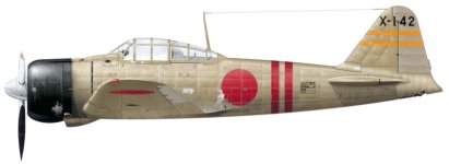
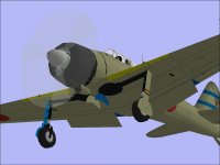
An early WIP, Akagi A6M2, DEC 41(ish). I'm thinking of trying to darken & intensify the yellow as we travel from Pearl, thru Coral Sea, to Midway, mimicking the time spent under the sun. I guess its then entirely possible for the replacement aircraft received to look paler & less yellow than the old warhorses...
of course it does also call into question the base shade for all those Rabaul temporary camo type repaints I did for Allen's Type 22 Zeros. As Shessi would say "yes, another project!".
Stef,
I hear ya
, & thanks for the reminder. Even now opinion seems split, although UV yellowed varnish would explain the reports of "yellow" A5M Claudes from the early days of WW2, as the Claudes would've been out under the sun for longer than the "new" Kido Butai Zeros.An early WIP, Akagi A6M2, DEC 41(ish). I'm thinking of trying to darken & intensify the yellow as we travel from Pearl, thru Coral Sea, to Midway, mimicking the time spent under the sun. I guess its then entirely possible for the replacement aircraft received to look paler & less yellow than the old warhorses...
of course it does also call into question the base shade for all those Rabaul temporary camo type repaints I did for Allen's Type 22 Zeros. As Shessi would say "yes, another project!".
Amerio
Hello All,
I don't claim to be an expert on the camouflage paint on the Japanese A6M2 series aircraft but this is my take from doing a lot of reading and following discussions out at J-Aircraft.com. THOSE folks are the experts in my opinion.
The original paint colour applied to the A6M2 series at the time of Pearl Harbor was a slightly greenish tinted Khaki colour called "Amerio".
The shade looked very much like the profile in post #23 by Kelticheart.
In the sun, the colour faded a bit and became more light gray.
The Cowl started as Black but faded to a dark gray with a hint of blue.
With all the time and research over the years, consider that a couple of the modern A6M reproductions carry this colour.
The evidence for this can be found in examining parts of aircraft structures: The parts exposed to the sun tend to fade to a lighter colour while the parts under overlapping panels remain a Khaki yellow green colour. I had a tough time trying to duplicate this colour also for my A6M2 a couple years ago. Everything that looked right in one kind of light would look wrong in another. (A mark of a great camouflage colour!)
Here is what I came up with by eyeball even though it is for CFS1.
- Ivan.
Attachments
UncleTgt
SOH-CM-2026
Hi Ivan,
I too have a lot of respect for the research done by the guys at j-aircraft.com. What I really do struggle with is the concept that Allied troops in the PTO would describe white, or very pale grey zeros in the first few months of the war, & this then became the accepted scheme, when the Amerio tint is depicted as quite a dark green tinted sky.
Anybody remember the paint term Duck Egg Blue from their aircraft modelling days, & the heated discussions over whether it was a green tint or a sky blue?
I think the tint must have chalked and faded extremely soon after application, meaning it must have appeared as a very slight colour shade.
So I tried an experiment (see below), with interesting results in the sim:
UncleTgt
SOH-CM-2026
Conclusions/ Theory
Note with all three of the above I've used quite strong colours, but have used paint masks (as I usually do) to tone down the impact to mimic the scale effect.
The Scale Effect
If you look at a small square of colour, it can appear quite strong in tone. If you view a large object, such as a whole aircraft , painted in the same colour, the colour impact is somewhat subdued.
Paint a 1/300th Panzer in Panzer Grey - it appears as a almost black blob. Look at photos of the real-life tank, & you can see light & shade. It appears several shades lighter, and much less intense in colour than the "accurate" paint chip.
This is why I've painted them as slight variations on a pale grey theme. Each one has just a hint of colour shading.
Now I can believe that either one of these might be reported by Allied Troops as White, or v.pale grey.
My theory is:
The Japanese used "clear" varnish on the A5M Claude to protect from corrosion, but this yellowed on exposure to sunlight & ozone. Hence the reports of golden-yellow Claude's.
They learned from this, & decided to apply a tint to the "varnish" used on the A6M2. This, when freshly applied is the Amerio colour. But exposed to sunlight & ozone chalked & faded extremely quickly (as Ivan describes above), & so we quickly arrive at almost white, with perhaps a hint of grey-green.
So, which one do you think I should continue with?
Should have a stronger colouring, as Ivan's CFS1 Zero (and the latest Warbirds)?
Or should I stay with my own theory?
Hello UncleTgt,
I also remember discussions in the days of plastic models and "Duck Egg Blue". I never had that many model paints back then. All I had were the Testors square bottles and I used whatever I had. None of them looked very good in any case, but they looked like aeroplanes and that was good enough for me.
This paint scheme is yours and you are of course free to do as you please. I do the same with mine and try to do a representative scheme rather than a particular aircraft in most cases.
For the others here who are not familiar with the J-aircraft site, this link is the best that I found that provides relevant detail to the discussion.
http://www.j-aircraft.com/research/jimlansdale/pearl/jimlpearl.htm
First of all, I believe your painting skills are excellent and the textures look better than the model they are applied on.
Whenever I work on a project, I appreciate constructive criticism that may help make the result better. Sometimes I have my reasons for doing things a certain way but sometimes I just don't know any better. If someone sees something that may be done better, then I would hope they would let me know.
That is the spirit I intend THESE comments to you.
From the tail markings, this appears to be a A6M2 assigned to the carrier Akagi.
There is very little question of the paint schemes of those aircraft. Artifacts from the Pearl Harbor raid are still in existence and are a good representative of those aircraft. The colours can be seen in various pieces from crashed A6M2s from that raid in the link above.
Other things that can be seen are the fuselage stencil (or rather where it used to be) on some of the wrecks. Someone chose to cut out the skin bearing the stencil which left an empty rectangle between the hinomaru and the horizontal stabilizer.
The outboard side of the no-step rectangle should not be there. It is really shaped like a U. I know my aircraft has it also, but it was released before I knew better and those are very old screen shots. One of the Jims at J-aircraft commented when I posted my rather fanciful paint scheme there to confirm the colouring.
I take it this is the stock CFS2 model?
I should break out CFS2 again to look because I don't remember their zero looking quite so nice.
- Ivan.
UncleTgt
SOH-CM-2026
Hi Ivan,
This is why I like it here in the Basement, lot's of open, honest discussion & exchange of opinions, without any grand-standing or point scoring.

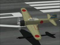
Yes, I'm attempting to do the Jap MS stockers in the same way I have been doing the US carrier groups. It is the stock A6M2.
Thanks for the heads up on the no-walk wing area outline. I guess the Japs never thought anyone would ever walk in from the wingtips..
My impression is formed (like many) from all that black & white photos & footage. Colour info, especially from primary sources is sparse, & seems to contradict what we think we see in B/W.
Here's another web source that seems to come down on the side of the caramel cream colour... http://modelingmadness.com/earlya6mcolors.htm
I have no axe to grind either way, I just want to do something that the loyal few still using CFS2 as their "time-machine" are comfortable with, so I posted to garner opinions in the hope I could find a consensus.
This is why I like it here in the Basement, lot's of open, honest discussion & exchange of opinions, without any grand-standing or point scoring.
Yes, I'm attempting to do the Jap MS stockers in the same way I have been doing the US carrier groups. It is the stock A6M2.
Thanks for the heads up on the no-walk wing area outline. I guess the Japs never thought anyone would ever walk in from the wingtips..
My impression is formed (like many) from all that black & white photos & footage. Colour info, especially from primary sources is sparse, & seems to contradict what we think we see in B/W.
Here's another web source that seems to come down on the side of the caramel cream colour... http://modelingmadness.com/earlya6mcolors.htm
I have no axe to grind either way, I just want to do something that the loyal few still using CFS2 as their "time-machine" are comfortable with, so I posted to garner opinions in the hope I could find a consensus.

Results look pretty good, UncleTgt.
There is another page at J-aircraft that shows the colouring of the D3A but it looks to me to be the same as the A6M series and both of your paint schemes look pretty good to me.
I still see a couple issues but am not sure if it is actually something you can get to. It might be in the model itself.
I believe many areas that were not marked were also "No Step" zones. Boarding the Type Zero Fighter was all done with retractable steps and hand holds. There were quite a few red dots for the pegs themselves or the button used to extend them. On my A6M2, those pieces are too small for the size of pixel I would need to use.
If you are hanging out in the basement, then I must be one of the residents of the sub-basement because there are a few of us that still build for the original CFS.
- Ivan.
Typhoon Willy
Charter Member
Hi Uncle Tgt,
I must say I admire your work here, especially the faded and chipped paint! I really get a sense of wear and tear on the Zero and Val. Even though they are stock aircraft, I've observed they do make a decent canvas for you, Morton, and even Sopwith Chameleon, among others. With the right paint job, the stock ac can look quite convincing. I hope you will continue your efforts and wish to thank you for your endeavor to make paint schemes as accurate as possible.
Very kind regards,
TW
kelticheart
Charter Member
WOW!!!!!!
Duck Egg Blue, eh?
You can imagine what a 11 year-old Italian kid, back in 1967, with a very elementary notion of English language must have thought, when he opened his 1/72 Airfix Spitfire MkIX kit and read the name of that colour on the instruction sheet.......
That was me and I still remember my reaction when I put together the translation using my school English-Italian dictionary... "Since when eggs laid by ducks are blue????" ....followed by endless discussions among my modeller friends: "It's the colour of the egg shell, not it's the colour of the yolk..".....I remember there was also a Duck Egg Green listed in some other plastic model kits, which made me conclude lots of British folks must have been colour-blind.....
Fortunately a couple of years later, Italian importers placed on the market the fabulous Humbrol matte enamel national sets, which settled all discussions. The two cans with early and late WWII RAF ventral colours were included, so we could not make mistakes painting our models anymore! It took me three months of dire savings to be able to purchase just one of those enamel sets!
ANYWAY: each one the Zero liveries you posted look like masterpieces to me!
If I were you I'd upload a mixture of them, representing various stages of weathering, ranging from planes freshly delivered from manufacturers to planes which were exposed longer to weather. Of course not of the same aircraft, but each one with different individual codes.
Thanks to Ivan also, for pointing out how the correct "No Step" wing rectangles should look like. Another detail I missed from the work of the late Akemi Mizoguchi, who painted them exactly as Ivan described in his last A6M2a Zero work.
I can't wait to download your IJN airgroup repaints, UncleTgt!
Cheers!
KH
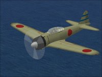
Here's my latest - darker, & trying to steer a middle ground between caramel & duck egg blue
Duck Egg Blue, eh?
You can imagine what a 11 year-old Italian kid, back in 1967, with a very elementary notion of English language must have thought, when he opened his 1/72 Airfix Spitfire MkIX kit and read the name of that colour on the instruction sheet.......
That was me and I still remember my reaction when I put together the translation using my school English-Italian dictionary... "Since when eggs laid by ducks are blue????"
Fortunately a couple of years later, Italian importers placed on the market the fabulous Humbrol matte enamel national sets, which settled all discussions. The two cans with early and late WWII RAF ventral colours were included, so we could not make mistakes painting our models anymore! It took me three months of dire savings to be able to purchase just one of those enamel sets!
ANYWAY: each one the Zero liveries you posted look like masterpieces to me!
If I were you I'd upload a mixture of them, representing various stages of weathering, ranging from planes freshly delivered from manufacturers to planes which were exposed longer to weather. Of course not of the same aircraft, but each one with different individual codes.
Thanks to Ivan also, for pointing out how the correct "No Step" wing rectangles should look like. Another detail I missed from the work of the late Akemi Mizoguchi, who painted them exactly as Ivan described in his last A6M2a Zero work.
I can't wait to download your IJN airgroup repaints, UncleTgt!
Cheers!
KH
UncleTgt
SOH-CM-2026
Results look pretty good, UncleTgt.
If you are hanging out in the basement, then I must be one of the residents of the sub-basement because there are a few of us that still build for the original CFS.
- Ivan.
I always wondered what that noise was late at night - seemed to be coming from under the floor...
T'was Ivan the mole!!