FS2004 Screenshots Here!!!

Slightly Delayed

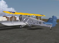
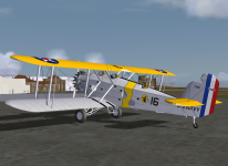
I said a week ago that I was about ready to upload my revision of the old T4M Torpedo Truck as soon as I checked the new skins for errors. I only found one thing I wasn't satisfied with - the base color. As usual, aluminized silver paint and dope gave me fits! I was pretty happy with the silver I used on Alan's Grasshoppers so I used it on the T4M, but after looking at it on the T4M I wasn't pleased at all. It just didn't look as good on that model. So I changed it. Due to a shortage of hobby time it's taken me a week to rework all the skins for the plane on wheels, but they're finished. Now I just have to rework the skins for the floatplane. There aren't nearly so many so it shouldn't take so long, unless real world matters keep stealing my hobby time.

Anyway, here's a preview:
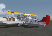
T4M 2-T-4.PNG
 
T4M looks great, Mick! :encouragement: You've always had the yellow wing color exact.
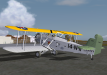
Thanks Jerry! :encouragement:

It was something of a project to come up with the colors. I started with the color chips in Major Elliott's first Monogram volume, which I didn't have back when I first painted the T4M (and so many of Paul Clawson's interwar Navy planes.) The chips were made from the preserved ceramic plates that are said to be colorfast for at least a hundred years. I scanned the chips and the scans didn't look the same as the chips in the book. So I made big images of the colors that filled my screen and propped the book up next to my monitor under bright light, then adjusted them until they looked to my aging eyes exactly like the chips in the book. But when I tried them on a model some of them looked too dark.

It dawned on me that I was up against a phenomenon that plagued me (and millions of others) back in the days of plastic models: scale effect. You may have seen models painted in authentic colors - dark olive drab and dark sea blue are good examples - where the models looked almost black. But if you look at those colors on real restored airplanes, or good quality color photos where there are people in the shot and their skin tones look exactly right, so the color rendition is good, the colors look nowhere near so dark as they looked on the models. Scale effect makes small bits of dark colors look even darker.

I happen to have good quality period shots of some VB-6 SBC-3 Helldivers with true blue tails, and of a lineup of Marine Corps SBC-4 Helldivers, and the true blue and willow green colors look much lighter than those color chips. Predictably, the lighter colors show much less scale effect. So I got my true blue and willow green by making the colors look like the photos to my aging eyes.

I have a suspicion that I could've lightened the insignia red a bit more than tiny bit that I did, but that looks in the photos pretty much like the chip color. Lemon yellow also looked very close, and of course it's hard to go wrong with black and white.

And yes, you're right. The one color that I found I'd had exactly right all along is the orange-yellow of the top of the upper wings. It's the only one (besides black & white) that I didn't have to alter at least a tiny bit like lemon yellow and insignia red, or more than a little like willow green and true blue. In the past I'd deliberately used a slightly lighter lemon yellow to show more contrast with orange yellow, but in fact the two yellows were very close - so close that once the Navy went from big solid triangles of section colors on the wing top to thin chevron stripes, virtually every squadron felt compelled to outline lemon yellow chevrons in black to make them visible against the orange-yellow wings.

Curiously, about color names: the Army's just plain "yellow" was much more orange than the Navy's "orange-yellow."

As for the silver, I knew what I wanted, I just found it really hard to get it.
 
You're an artist, Mick! Plain and simple!

Whatever you come up with, it's worth the wait! :jump:

Jorge
Miami, FL
 
You're an artist, Mick! Plain and simple!
Whatever you come up with, it's worth the wait!
Jorge
Miami, FL

Thanks Jorge! :encouragement:

I downloaded your repaints for the F11C and F4B and I think you matched the official colors very closely. I thought you might have been nipped lightly by scale effect on those two troublesome colors, willow green and true blue, but you were pretty much spot on. You probably got as close as I did. We both got a lot closer than I ever did in years past when I was painting Paul's and some other models, like the original T4M skins. And closer than I ever got on my long shelves full of inter-war Navy, Marine and Coast Guard planes in 1/72 scale plastic.

The green was just so light or dark that the Navy specified black as the contrasting color to paint markings on it, but Grumman used white and the Navy accepted it.

Way back in the nineties I wrote to the late, great aviation photographer and historian about a photo in his book U.S. Navy Aircraft 1921 - 1941. There was some uncertainty about the tail colors of a plane in a black & white photo (it was willow green, of course!) and when he wrote back he finished with a comment that I can echo here. My aging memory forces me to paraphrase rather than quote, but he said it was a great pleasure to discuss this stuff with people who understand.

Here's a couple screenies of Naval Air Reserve planes to show my interpretation of willow green and true blue. Not much different from what you came up with.


Oakland.PNG Brooklyn.PNG
 
If I remember correctly from things I've read, the "mixing" of colors wasn't that "exact" back then.

Besides, you combine that with months at sea, sea-salt water, sun, and just regular flying, it would all be enough to change the tones a bit. :untroubled:

Take whatever time you need!

Jorge
Miami, FL
 
If I remember correctly from things I've read, the "mixing" of colors wasn't that "exact" back then.
Besides, you combine that with months at sea, sea-salt water, sun, and just regular flying, it would all be enough to change the tones a bit. :untroubled:
Take whatever time you need!
Jorge
Miami, FL

Yes, of course. The salt sea air wrecked the paints and dopes available in those days amazingly quickly. Airplanes needed repainting and recovering almost yearly. There's a photo in one of the Larkins books of a plane that was no longer in service and left sitting outdoors. It had been there only about a year and it looked like it had been there for a decade or two. In these times of permanent paints and dopes (or I should say "coverings") and lifetime fabrics, it's hard to imagine how much maintenance those old airplanes needed.

And while the Navy had very specific color standards, as manifested by the trouble they went to to make and preserve those ceramic plates, as you said, that doesn't mean that the paint manufacturers always matched those standards. I'm reminded of the old wisecrack, "Close enough for government work," which I admit has some truth to it even though it offends me after a career in government throughout which I never heard anyone say anything like that or act that way.

One thing that frustrates me about this kind of questions is knowing that there is always a correct answer - things were some certain way and not any other way - but we may never be able to discover just what that answer is.
 
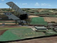
Bekesbourne

bekesbourne 1916_1.jpg

Another lost airfield; Bekesbourne was active from 1916 (home to part of 50 (Home Defence) Sqn RFC); then became civilian, home to Kent Flying Club, finally re-activated as RAF Bekesbourne in 1939-40 it closed after Dunkirk

Runway directions are 'best guess' based on some old cine footage online of Kent Flying Club

ttfn

Pete
 
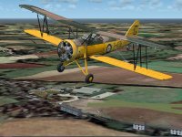
bekesbourne 1940_1.jpg

and in 1940; just as the 'Phoney War' period is coming to an end; Lysanders of 13 sqn in residence to carry out reconaissance over the French coast; a couple of visiting Hurricanes

ttfn

\pete
 
T4M up the pipe!

It's gone up and should appear on the download page presently.

I finally came up with a silver dope base color that I can live with.

Boston.PNG
 

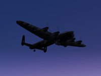
What a coincidence. Yesterday I stopped during my cycling ride, to visit the monument, close to the Amsterdam Harbour, where the Lancaster JB 657 crashed. It was shot by the German night fighter ace Heinz Wolfgang Schnaufer on its return flight from a mission over Berlin. The aircraft crashed on a farm house. The crew consisted of 2 Australian, 2 Canadian and 3 British airmen. All airmen and 6 civilians in the farm house were killed.

The monument consists of a propeller on a pedestal and two small walls. One wall points to Berlin, the other to East Kirkby. Behind the walls there are 13 trees, one for every person who died.

Just one small monument, but it tells quite a story.

Huub

7y2gMSE.jpg
 
French fighters do have something special

don't you agree?

ISBNovs.jpg

abd Nieuport 17


Yjp5vXQ.jpg

Stuart Green's SPAD S.7


5WCOvLA.jpg

Craig "full" Richardson's Dewoitine D.510


YGaL2EC.jpg

Restauravia's Bloch MB.152


Qv8oQv4.jpg

Dewoitine D.520 by Jean-Marie Mermaz
 
And some jets

wCrtJIF.jpg

The Mystère IV A by Restauravia


hdyZumD.jpg

Mirage IIIE by J.E Narcizo (repaint by l'iguane)


iy4j9My.jpg

Mirage F1 by Kirk Olsson


8QboHJQ.jpg

Roland Laborie's Mirage 2000 (repaint by l'iguane)


01cnE6M.jpg

The VPA Rafale C (Repaint again by l'iguane)

Cheers,
Huub
 
It wasn't my intention to give a complete overview. So I made a selection. But The Morane-Saulnier MS.406 should perhaps have been in this overview. And the twin engined Potez 630 and perhaps the Breguet 690, although you could argue whether this is a real fighter, but the code C3 stood for "Chasseur triplace".

But what I tried to show was that the French fighter had a recognisable look over the years. And in their own way even looked quite pretty. Something which can't exactly be said about their bombers in most cases......

PU8ntYp.jpg


Cheers,
Huub
 
Back
Top