Conspicuous by Their Absence

Hi Hubbabubba,

(...)

As you already know, the 100 AVG planes came from a British order. They were painted in what passed for RAF colours and the exact colour match is a matter of debate. These were Dupont paint colours used by Curtiss and didn't quite match RAF specifications. Even the pattern of camouflage seemed to differ with each example.

- Ivan.

You're giving me a credit that I don't deserve, Ivan. But I know that the British were not very fussy about "color rectitude". Roundels, flash fins, patterns would vary considerably, sometimes from one aircraft to the next. American orders were no exception. Apart from PRU units, they had a very little interest in camouflage. Not all pilots were happy about that BTW...:kilroy:
 
Hi Hubbabubba,

The problems are this:
Original colour photographs are not very plentiful.
Colour photographs that do exist are generally not predictable as far as lighting and shades may not match because of the various processes of the time.
The 100 planes from Curtiss were sposta be for the RAF, but Curtiss took many liberties with equipment and perhaps paint.
The paint used by Curtiss definitely did not match RAF specifications, but the opinion is that no one was really bothered by that.
The paint scheme is very similar to the Spitfire "B" scheme, but not exact. The Spitfire "B" scheme is well documented.
The paint scheme on the AVG aircraft was NOT consistent.
There are many modern P-40s, but only ONE modern P-40B/C painted as an AVG aircraft. That aircraft doesn't even come close to matching the patterns and colours to be found on the originals.
There are a bunch of modern P-40D and later aircraft painted as "AVG" aircraft, but the markings there don'nt necessarily match those of the earlier Tomahawks.
Plastic model planes are another source, but are just someone else's interpretation.
Although the Dupont colours are specified and model paints are made to that spec, the exact shade seems to vary a LOT depending on the source.

What we DO know is that the Brown and Green seemed to be very close to each other when photographed in Black and White.
AVG aircraft also did not carry consistent paint schemes, unit markings, or even shark mouths.
Although the British called for air brushed camouflage, the masking used by Curtiss resulted in very sharp lines between colours.

I guess I have a LOT of room for interpretation.
- Ivan.
 
I'm pretty much in agreement with your comments and remarks, Ivan.

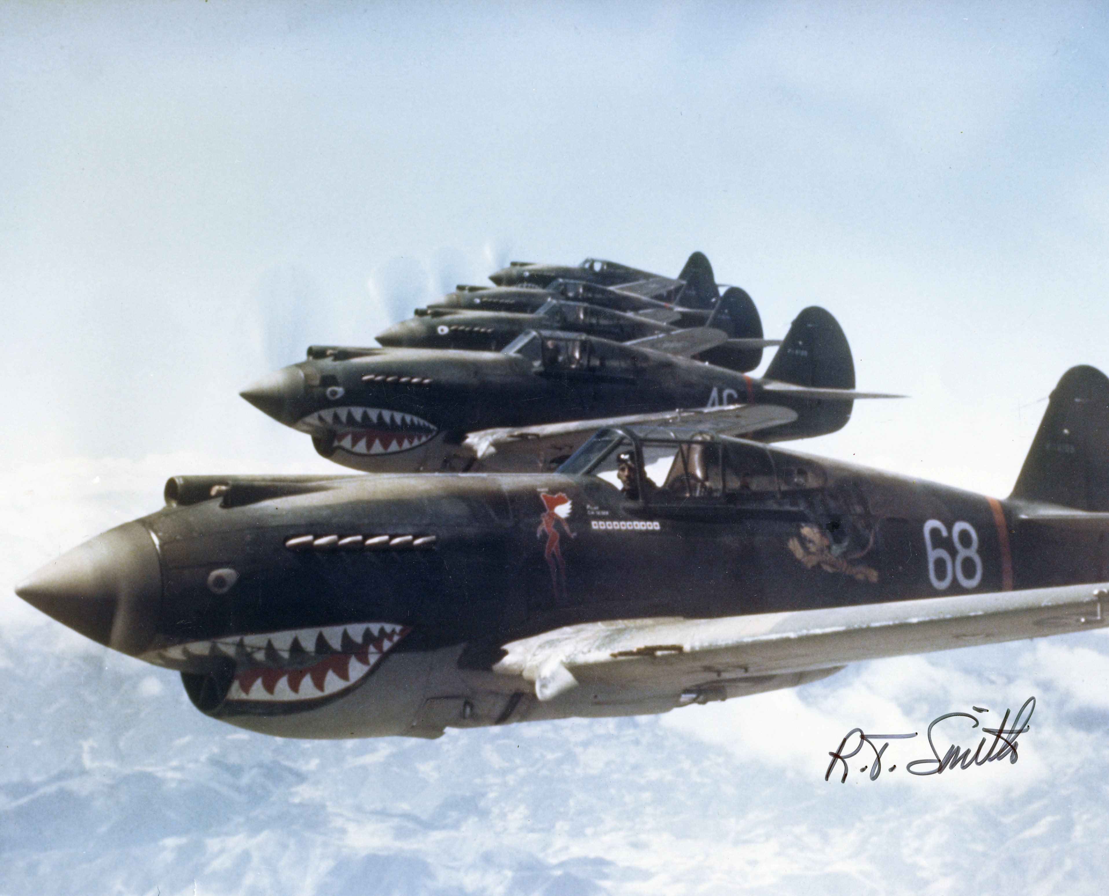
Here is a quick n' dirty image search;

Hells_Angels%2C_Flying_Tigers_1942.jpg


Colors are difficult to figure, but nose arts show a variety of license. Note that the fin of the aircraft further away in that line-up is somewhat different.

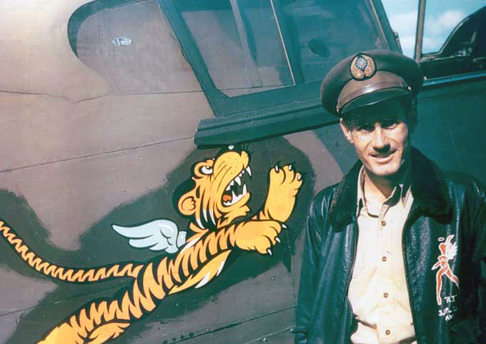
Flying_tigers_pilot.jpg


Colors are well seen here but, judging by Robert "R.T." Smith face and shirt, yellow was favored a bit, probably to show Walt Disney's art. Fading is not too important though and it should be easy to correct. I did it by enhancing blues and diminishing reds and greens in the RGB palette and found very little overall changes. Also note that the tiger was painted over a brushed patch of a green paint that doesn't match the rest; the camouflage green is more blue-ish.

older02.jpg

Same aircraft (and pilot) from a different angle. Blues are more present (look at the sky) which, in turn, tends to blend greens and browns in a less clear cut" pattern. Dust and dirt covers cowling, fuselage, and wings, which helps the "blending".

FlyingTigersLogo.jpg


Another vintage picture. Taking into account fading, colors adjustments made when the pictures were taken, dirt and dust, I would say that the brown was rather light with a distinctive touch of pink while the green was dark with some blues overtones. Taking all these pictures, and some others, I got R:58, G:86, B:84 for the green and R:117, G:102, B:98 for the brown.

Of course, you can modulate these two colors to adapt to sun fading, dust, dirt and staining, but I think they're pretty much what it should be.
 
Hi Hubbabubba,

Sorry I didn't get back sooner. I just finished the week from heck at work. This week, I turned on my development computer three times and each time I was too tired to get ANYTHING done. I just turned it off an hour or two later without ever having sat down to do anything.

The first image is what I get with using your RGB specifications in MS Paint.

To me, this doesn't look bad at all but seems to look a bit faded rather than factory fresh. I think the Green needs to be a bit darker and have less Blue in it. The Brown needs to have a bit more Red and less Gray in it.

The next two images are modern interpretations of the Dupont colours supposedly used on this batch of P-40s.

The following image is a collection of what I believe to be fairly reasonable colours though none are exactly right.

The last image is the "Official" interpretation of the Brown using the FS paint codes. I believe this to be the best of the bunch but probably should still be a touch darker. I didn't post an equivalen FS paint code for the green because I was not able to find one. I believe the existing green on my aeroplane is fairly good but needs a touch darker also.

....to be continued.
 
.....

I believe the image attached here is what I should be trying to achieve.

There is one more serious additional limitation:
CFS planes use a set palette and none of these colours are really an option. We can come close, but not quite.

For the Green, we have a choice of two series: One goes from Light to Dark Green and one goes from Light to Dark Olive. I believe the green is a bit more correct here.

For the Brown, we have again a choice of two series: One has a fair amount of Yellow / Red in it. In the lighter shades, it tends toward Orange or Mustard. The other series goes from Light Tan to Black Brown. I believe neither is really correct and that it should be somewhere between the two.

I'll leave the discussion for later.
Good Night.
- Ivan.
 
Hi Ivan:wavey:

Here is a "collage" of my RGB interpretation compared to four possible brown-green RAF interpretation according to Dgital RAF WW2 colours (available as a PDF HERE) and Color Reference Charts - United Kingdom found HERE;

View attachment 54431

I think that Dupont's interpretation of dark green and dark earth, combined with the semi-desertic conditions under which the Flying Tigers were operating, would be quite close to my own interpretation.

Now, concerning the "palette limitation", I'm not sure that I follow you. I can modify CFS palette whenever I want, don't you?
 
at the risk of being a pain...
(something i excel at)
i have a slightly different point of view.
...i know, shocking, isn't it?

i prefer the "well used" appearance,
as opposed to "factory fresh".

sun faded, chipped paint,
replacement parts miscolored,
brush strokes, even dust and dirt,
make a model look more realistic.

do museum aircraft really fly?
sorry, i prefer down and dirty working class.

i must agree that the AVG Flying Tigers
are the very cool, P-40 icon.
from what i gather,
each ac scheme was painted in the field
and each was slightly different.

but once again, my personal preference here,
i lean towards the work a day,
plain jane P-40 scheme that the majority,
down and dirty, unsung heroes flew.

while it's true that my paint program skills are very limited,
i wonder if a layer or two can be added
just for defects, flaws and dirt.
 
Hi Hubbabubba,

I HAVE tried to alter the palette for CFS aircraft. Perhaps I goofed it up because I have never been successful at getting the intended result. The most recent attempt was to paint my A6M2 Model 21 Zero in the slightly greenish gray that the IJN used for their carrier planes. That didn't work either. Perhaps I need to try it again.

The idea of using RAF standard colours isn't bad, but it was known that Curtiss Dupont colours didn't really match the proper RAF colours.

Hi Smilo,

I kinda like to have planes that are factory fresh and maintained as well as possible. That is in the same spirit as having aircraft that always meet or even slightly exceed the best of the performance figures fo the type. Some exhaust stains and tracks off the guns' ejection ports is fine, but rust, corrosion, large amounts of chipped paint are not in the same spirit. My mechanics would never allow for that to happen.

Need to run. We will have guests here shortly.
- Ivan.
 
yup, i understand your point of view
and appreciate it.

as i see it, there wasn't much time for spit and polish
out there on the far flung strips in China
or anywhere else for that matter.
especially, when we were on the ropes.
i believe the people involved
were more than happy just to get the planes in the air.
in many situations, the mechanics did the best they could
with whatever they could find.
cannibalism was the order of the day,
except, maybe, stateside.

i keep going back to the pictures posted on #423.
in each picture, the planes look like they have been
around the block more than a few times.
it's a true testament to the unsung heroes
who were on the ground,
keeping those crates air worthy.

we're heading over to the inlaws shortly
for an early Christmas dinner.
ham with all the fixin's
and smilo's custom made,
extra cheesy, scalloped potatoes.
 
First about CFS palette...

Hi Ivan and smilo:wavey:

Ivan's remarks about "FS palette" limitation puzzled me a bit. Not having this aircraft, still a work in progress, I had a look at his EIII Fokker Eindecker and discovered, to my own surprise, that all textures were sharing exactly the same 256 colors palette, even the pilot! This palette is, incidentally, that famous "FS" palette. Before CFS, only the first 128 colors could be used (0 to 127). In the "palette" window, they're the colors on the columns left of the two black ones. Everything to the right is "out of the picture" so to speak. I think Ivan used Convr8 to switch from R8 to BMP textures

ivanpalette.jpg


That Ivan could do so much with such limitation speaks volume of his talents, but it is an unnecessary limitation. Even the truncated BMP that are the R8 textures ( the "AF" textures we often find in older aircraft ) can be modified with the proper tools. Personally, I'm using Saint Paint, but I think that a few others do permit to tweak the palette of a texture. One of the main reasons that had me buying Saint Paint was that feature. From an "Ebenezer" like me, that says a lot...

I see no reason for a CFS1 modeler to limit himself to 128 colors, as the game supports 256 colors BMP, and these 256 colors can be any colors, not only "FS approved" colors. This limitation is only imposed by Convr8 own limits, not by CFS (or by FS98 for that matter). To convince you all, just have a look at "spit_l_side.bmp" palette in Saint Paint;

cfspalette.jpg


It is obvious to anyone who's not colorblind that this palette is not "FS kosher". Incidentally, the color picked-up on the tire is #204, which proves that CFS bitmaps texture are going beyond #127.

Now, considering the attachment "fs 30219 tan brown-1.bmp"; it is not a color. I've dowloaded it and I get a "True Color" (16 777 216 colors) bitmap. Reducing it to 256 colors with Saint Paint using the "Best colour match (no dither)" (yeah, Saint Paint author is a Brit...) function, I'm left with 26 "sub-colors" in the "brownish" section.

brownish00.jpg


To make it obvious to all, I've "spread" true yellow (R= 255, G= 255, B= 0) to true blue (R= 0, G= 0, B= 255) and got this patchwork;

brownish01.jpg


Strangely, the other color samples are true unique RGB colors BTW. Returning to a "True Color" bitmap and reducing it again, but this time to only two colors (or colours), I got this;

brownish02.jpg


I think that the approximation is quite close, don't you think? (The image you're looking at is a JPG format with a "True color" palette BTW) Anyway, it gave me R= 140, G= 102, B= 84 for the brownish color. Of all the Dark Earth Ivan and I have presented, my own interpretation offers the closest match, anyone interested could go and try it.

Enough for now. You know at least two things by now; why I thing that my interpretation, based on actual vintage pictures, is the best and why I departed from a few bucks to get Saint Paint...
 
Hello Hubbabubba,

Thanks for the research. Actually my process these days is to convert from .PCX which is what AF5Paint uses to .BMP directly using the Microsoft Photo Editor. It also needs a rotation sometimes but a lot of the flipping or mirroring can be done via either AF5Paint or MS Paint.

That Pilot's Face that you see for the Eindecker is probably the most interesting thing I have ever painted. It isn't derived from a photograph or scan or anything. It is just hand drawn over a few days with AF5Paint. It was quite tedious.

As for actual colours for the AVG P-40, I believe going one shade darker using the AF5Paint palette (FS Palette) works well enough for me. I was hesitant to do this because the next shade down was too dark to make a good panel line, but since my panel lines are going to be applied via GIMP Layers, hopefully it won't make a serious difference. I'll probably try out the idea again with the A6M2 Zero. With AF5Paint, I am probably not using more than the original 127 colours.

I did make a rather large mistake though. I had the camouflage "Pattern" on the aircraft texture files pretty much done but neglected to save off a copy before overwriting them with an earlier camo pattern..... Need to do some of the layouts over again. That is what happens when one is a bit too tired to be doing anything important....

- Ivan.
 
Here is what I believe to be a fair representation of the AVG Paint scheme. There are many more things that can be adjusted, but the pattern was what I was going for here. I don't know the pattern is really all that accurate either, but it is my interpretation. You can see a pretty serious difference on the Port side under the canopy.

These shades are just a touch darker for both colours than the last screenshot I posted.

Now for all the rest of the markings.... I want to do some research as to the claims by each of the three squadrons first.

Time for Dinner.
- Ivan.
 
Hi Hubbabubba,

Your posting of the textures for the Eindecker is reminding me of exactly how few resources that project actually used. The Rudder, Elevators, and the Wings are all 2D objects. The biggest problem of that project was trying to line up the propeller hub so that it would not look like it was wobbling when it was spinning. I don't believe I got it EXACTLY right, but I think I got it close. The Engine animation was easier just because it was bigger.

I need to go look for photographs to see if the camouflage on the P-40 extended under the Quarter Windows. I suspect that it really did not even though the camo was applied before the plane was assembled.

- Ivan.
 
Now, considering Temperate Land Scheme...

Hello Ivan, smilo:wavey:

Ivan, I think that you're going way too dark in your last screen captures. I found a site where a guy did his homework on that very subject; HERE. I must say that he makes for a very convincing argument. Since we don't have to bother ourselves with plastic modelers paints mixing, I was able to reproduce exactly the DuPont's Temperate Land Scheme he elected to choose;

hw01o.jpg


It is darker than my own, but lighter than yours and, a fortiori, than your last attempt.

I don't know if you realized it but they are far more colored vintage pictures of AVG P-40 going around than of the whole RAF fighters of the 1939-41 era. The following picture (only part of it), taken out of a book called The Royal Air Force of World War Two in Colour, Roger A. Freeman,(Arms and Armour)...

rafearly.jpg


... was taken in the spring of 1940 over the Chanel. It is one of the few color picture of an actual British-made fighter with its original Temperate Land Scheme on. I have tried to lower red component and boost blues to correct the fading and bring more light to the whole image, but even the "untouched" aircraft is in lighter tones than yours. This was the one picture I considered when I was saying that you were "spot-on". To find good Dark Green / Dark Earth / Sky Blue pictures, we have to rely on non-fighters airplanes like this one...

Miles_M.25_Martinet.jpg


This excellent vintage picture shows a much lighter scheme. It is a Miles Martinet target tug BTW. Another good picture, from the same book already mentioned, shows a Douglas Boston...

douglasdb7.jpg


... which gets pretty close to Temperate Land Scheme. I don't know if Douglas was supplied by DuPont, but it can't be very different from Curtiss. Someone would have noticed, don't you think?
 
Hello Hubbabubba,

I believe part of the problem is that there wasn't just one colour scheme for RAF Day Fighters.
They eventually went to something that I have seen described as "Sand and Spinach". The Spinach part isn't that much in debate here. I just don't think the AVG planes had the "Sand" part. Later P-40s in service with the USAAF did though. The Brown in discussion for the AVG planes wasn't a "Tan" though sun may have faded it to that. I believe it started as a darker Brown with much more Red in it.

http://www.ratomodeling.com/articles/AVG_cammo/nmnaret1.jpg

The link you posted was one of the sites I thought was most useful. I had seen it before which is why I believe the AVG Green was a GREEN rather than an Olive colour. The AVG decorated plane that is used for colour comparisons is much more Green than the "Temperate Land Scheme" you posted. Even 71013 doesn't seem to have enough Green in it, but it is close. FS 34092 seems to have enough green, but seems too light to match the paint on the actual plane.

The 71009 Brown is much lighter than the paint on the actual plane in my opinon. One thing to observe in the photograph that is linked is that it was taken up close with a flash. Note that at the front of the mouth, even the BLACK outline of the mouth is only a medium Gray. The outline is Black toward the back corner of the mouth. There, you can see that the paint colours are quite a bit darker than either the Green or the Brown being compared.

Need to get home now....
- Ivan.
 
I do not mean to interupt this heated discussion, Just wanted to wish all of ya'll a very safe and happy holiday season. With special thanks to Hubba, Ivan and Smilo for everything you have helped me with over this year.

I am humbled by being associated with some of the best people on this planet.

Dave :salute:
 
Hey Folks,

I, for one, appreciate Hubbabubba's points. He generally brings up pretty good ones. This isn't so much a "Heated Discussion" as folks sharing in some research. He doesn't have to mess with this, but he is still taking some time to show what he has found.

Thanks Hubbabubba!

Attached is a screenshot of the P-40 with three different schemes. One is on the Left Wing (a Shade Lighter), One on the Fuselage (Original), and one on the Right Wing with a Tan / Brown scheme. All look wrong. This evening, my house guests are talking behind me while I am on the computer. I don't speak the same language, so..... I guess I should give them some privacy.

Merry Christmas Everyone!

Good Night.
- Ivan.
 
this year, we're doing something different.
we will be heading for Seaside, Oregon
Christmas Eve and will return Monday.

so you kids be good
and have a Very Merry Christmas.:santahat:


^^^^:jawdrop:^^^^
look at that!
it must be important,
smilo used caps.
 
Hi Smilo,

Don't worry, we won't break any furniture.

.....

Here is another attempt.... I believe the Starboard Wing looks better, but the Port Wing matches paintings of the originals.

- Ivan.
 
Back
Top